COVID-19
In order to understand the spread of COVID-19 better, I developed computer simulations by
using the MATLAB software. The code simulates how the virus is transmitted and eventually
dies out. The latter effect is also known as herd immunity. Please note, that I just started
this project and, at this stage, it is only supposed to provide a qualitative explanation
of certain effects. However, it still matches the curves observed here in Manitoba, Canada.
The following animation was produced by the aforementioned code. The blue dots represent humans
who never had the virus whereas the red dots are people who currently have the virus and by making
contact with other humans (blue dots) they give them the virus. However, after a certain time,
the humans having the virus, recover. The recovered cases are represented by the green dots.
It is assumed here that this group is immune. The possibility that people can die from the virus
is not yet part of the simulations but this effect is less important.
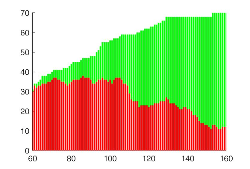
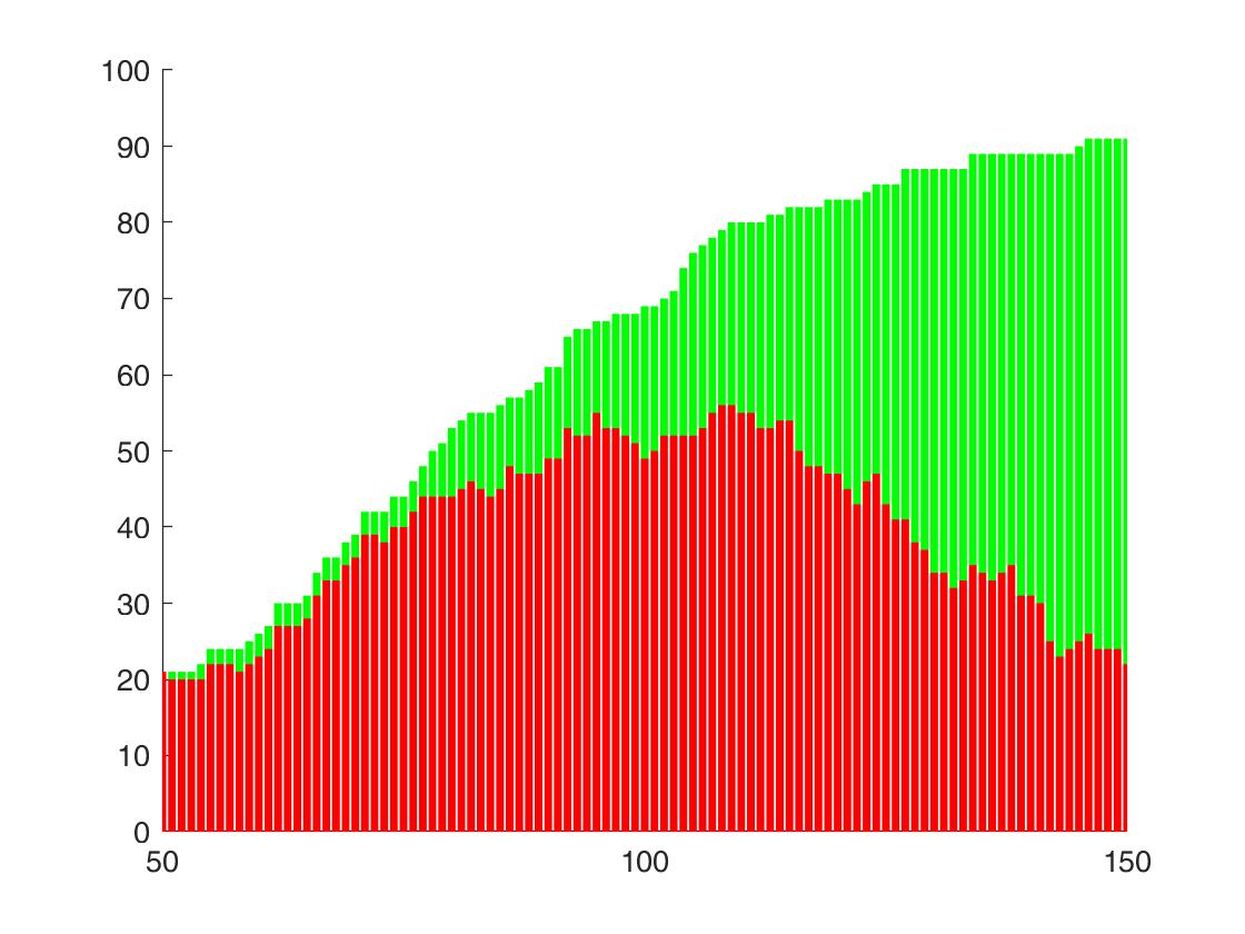
The following plot was obtained from the simulations. Green corresponds to the people who had the virus but
recovered. Red cooresponds to the active cases.
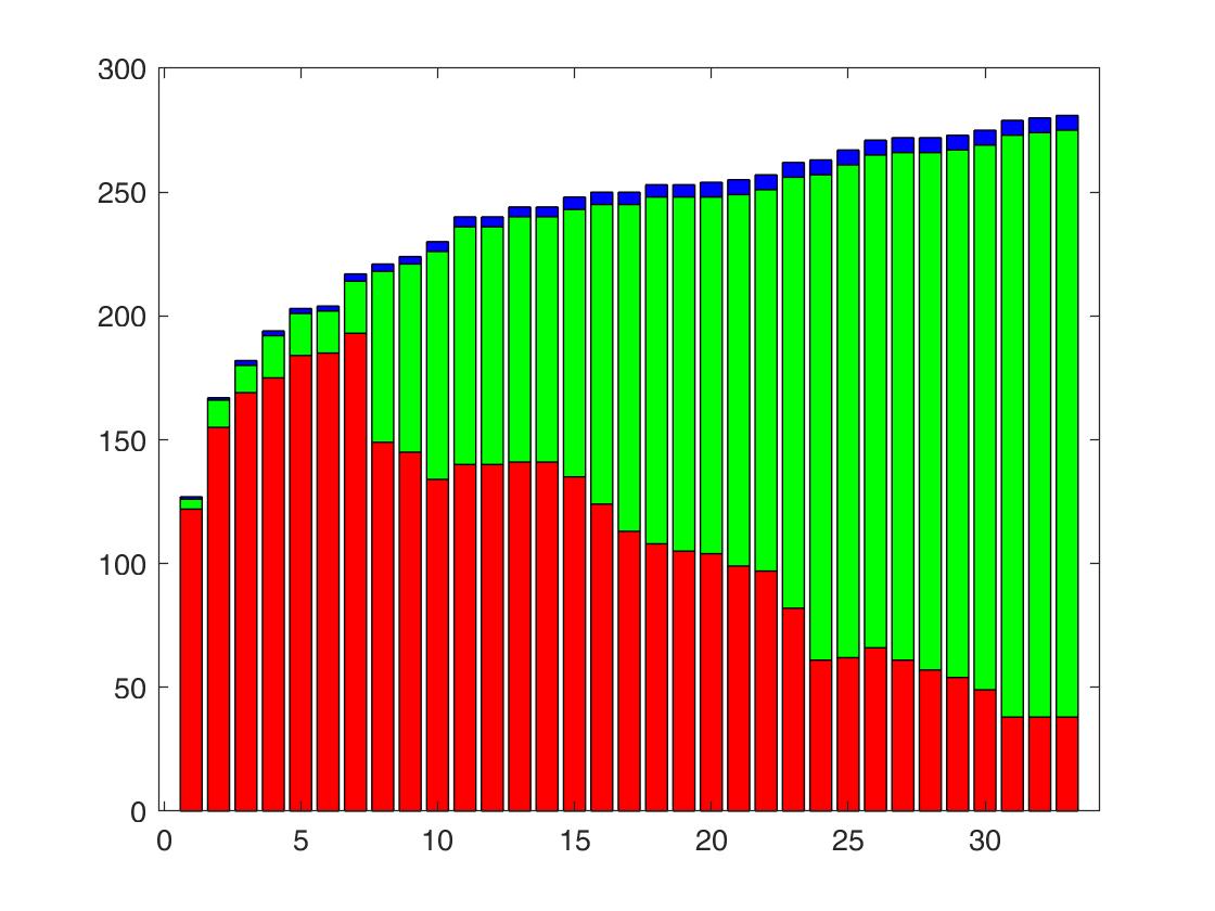
The following plot shows the real data here in Manitoba. Again green corresponds to recovered cases and
red to active cases. Blue are the people who died because of the virus.